Website redesign
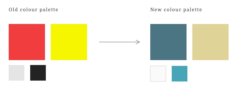
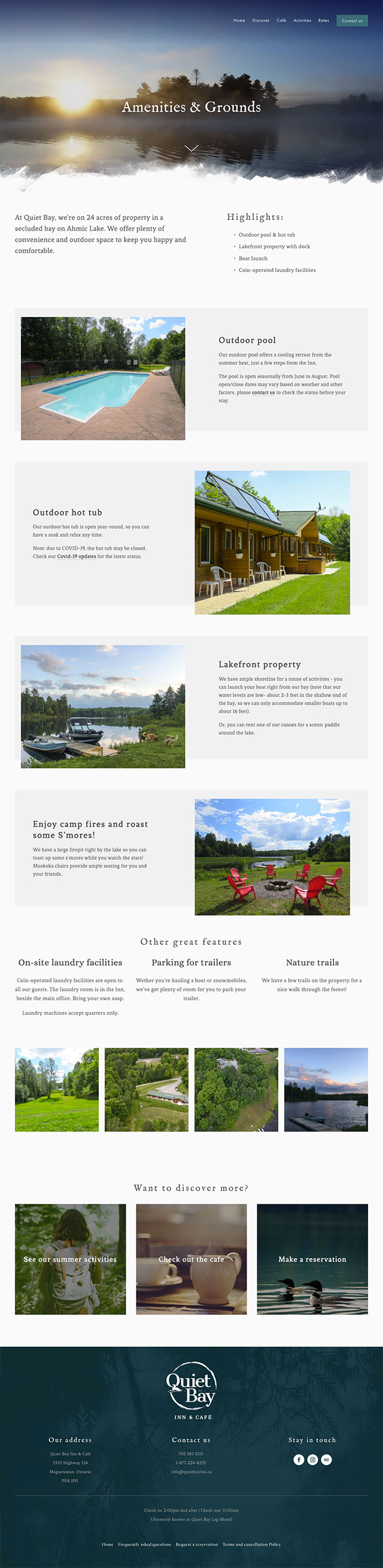
One of the first considerations was the colour palette. The previous branding featured bold reds and yellows, which are dramatic and loud. I chose to opt instead for calming cool tones and earth tones, creating a serene palette to drive home Quiet Bay's key value proposition; being a peaceful wilderness retreat.
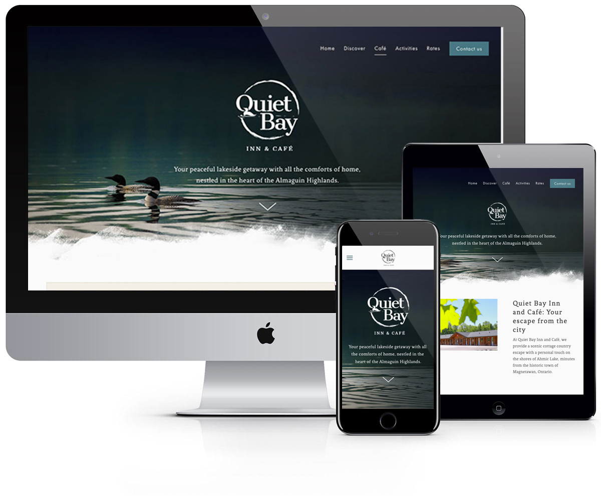
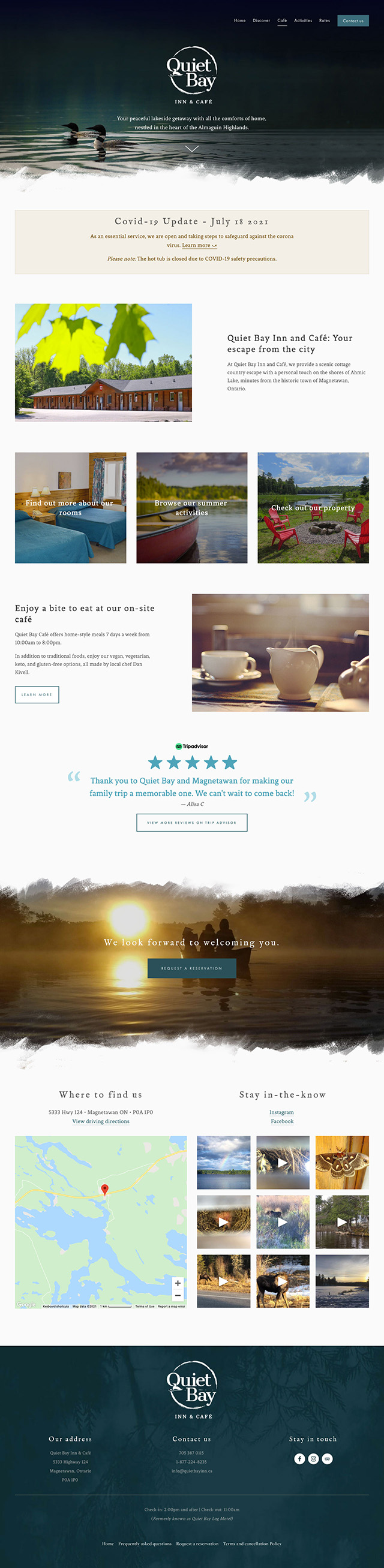
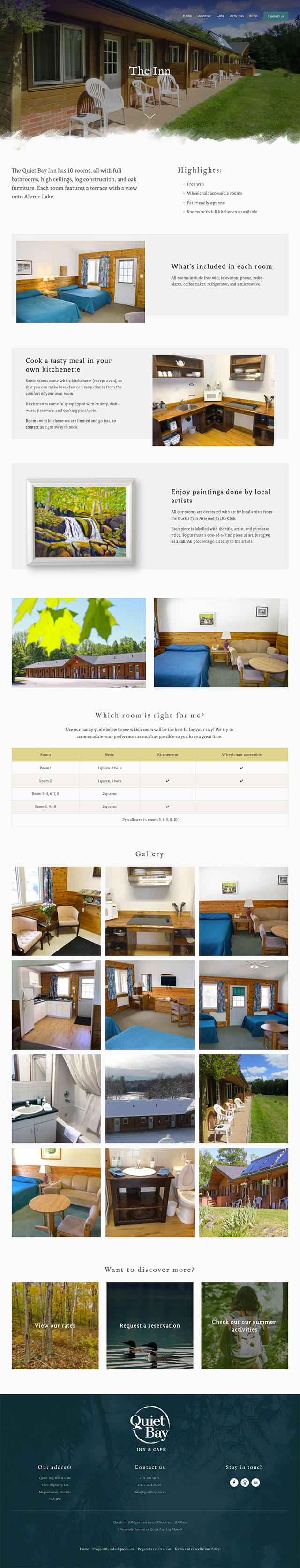
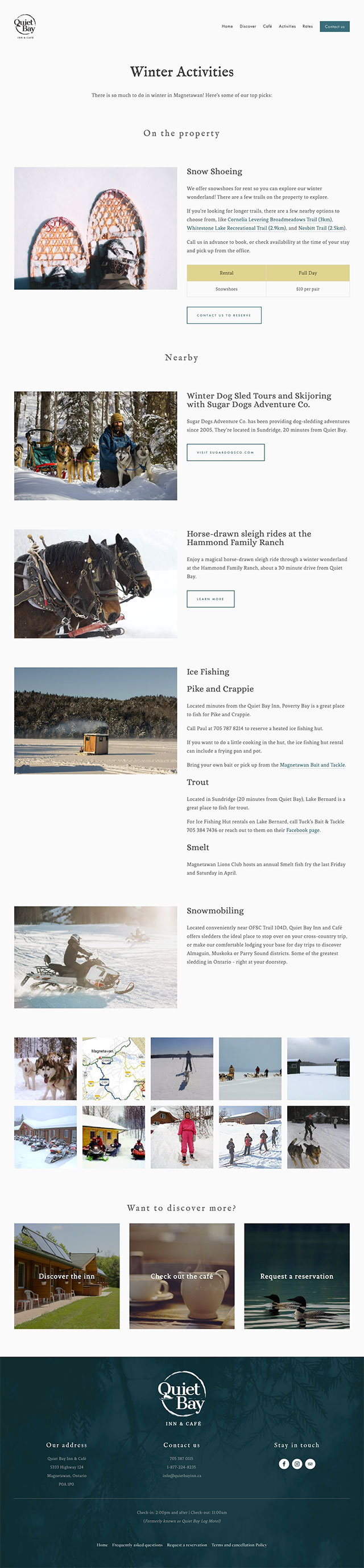
For the design, I focused on showing off the beautiful location of the Inn. Being situated on 24 acres of land with ample lakefront, Quiet Bay was uniquely positioned to offer a calming retreat back to nature.
Driving direct bookings
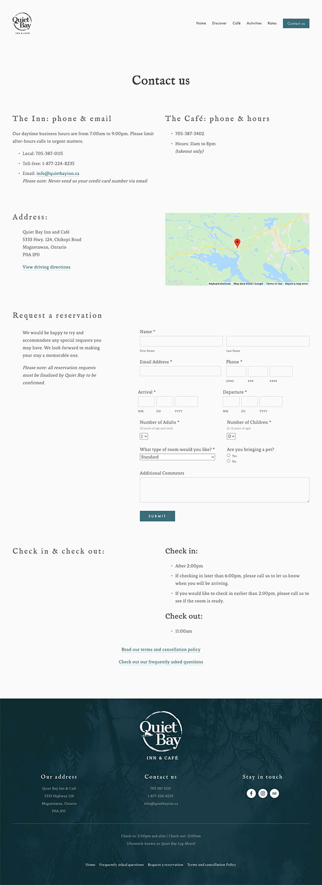
Due to cost, the client did not want to pursue their own online booking engine. Instead, I had to come up with a solution to drive direct bookings via the website. I created an online booking form to encourage direct bookings.
In addition to countless phone bookings driven by the website, this contact form leads to 30+ direct online bookings per month, creating significant cost savings since online booking systems like Booking.ca and Expedia take 15% commission on all bookings.
Improved user experience
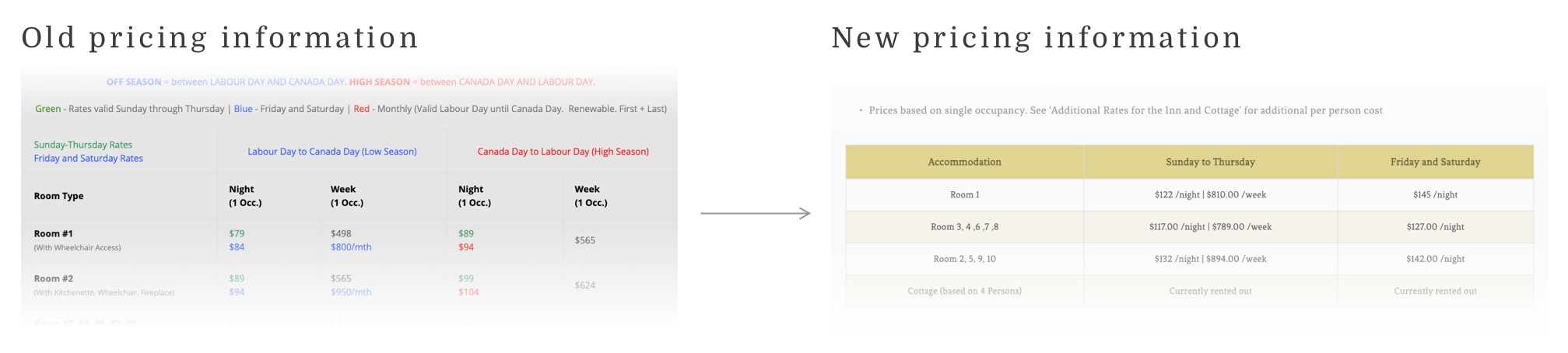
Previously, a user had to interpret a complicated table that included colour-coded text in order to determine what price to expect for a room.
At first, an interactive calculator was proposed, but due to cost considerations, the clients wanted to go with an approach that didn’t involve JS or Jquery. Going back to basics, I determined a new content organization scheme that involved multiple tables with clear headings, and removed the idea of colour-coded text entirely.
This not only is a much clearer way for a user to absorb the information, but it also reduced cognitive load and increased accessibility. Additionally, these tables had custom CSS applied to ensure they were scrollable on mobile devices.